From Generic Template to The Wise Operator: A Full Rebrand Using ChatGPT and Claude Code
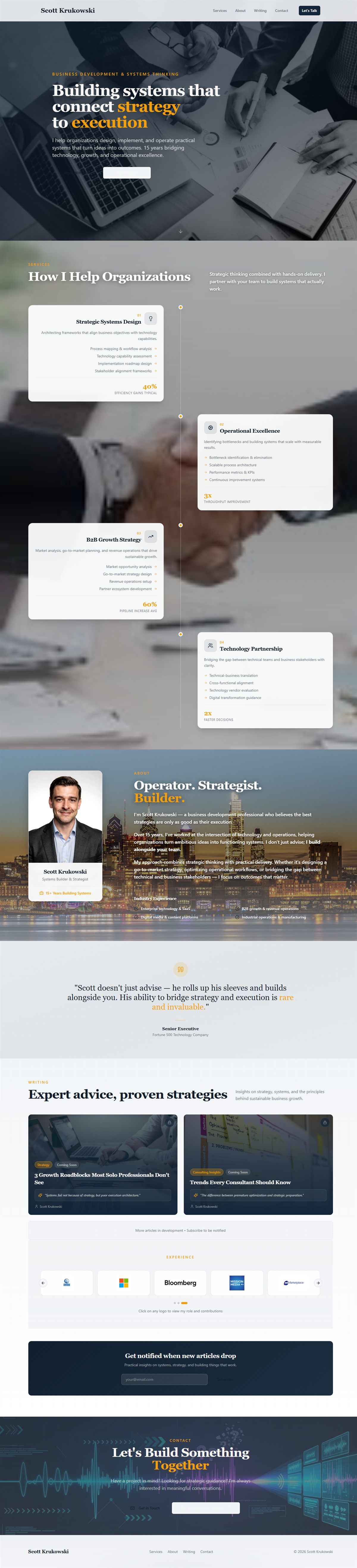
Light background. “Building systems that connect strategy to execution.” Floating service cards. A headshot with “Operator. Strategist.” underneath it. A dark footer. Fine. Functional. Forgettable.
That site was built in Lovable: described what I wanted, got a working site in hours. The content was mine. The design was generic. It looked like every other AI-generated professional services portfolio from late 2024. Swap the name and the photo and it could have been anyone.
The migration to Astro solved the architecture problem. The site got real control: proper static routing, content collections, a component system, SEO metadata. But the visual identity migrated with it: same light grays, same navy text, same muted gold. Different framework, same face.
Then I noticed the split.
The Problem: Two Different Sites Living in One Codebase
After the Astro migration, the navigation bar was manually set to pure black with cream text. I had done that early as a quick brand decision and it stuck. The nav looked like The Wise Operator. Everything below it looked like the old Lovable site. Light gray background. Dark navy headings. Medium-gray body text.
Every page was visually schizophrenic. Dark nav, light hero, dark footer, light sections in between. No unified identity. No visual consistency. I could feel it every time I looked at the site but could not fix it by tweaking individual components. The problem was the foundation. The design tokens were wrong.
I needed a brand system before I could fix the code. And I needed a logo before I could define the brand system.
Step 1: Creating the Logo in ChatGPT Image Gen
I opened ChatGPT and started prompting for a logo. This is slower than it sounds.
Most people approach AI image generation by describing what they want literally: “a logo with my name in it using a gold color.” That produces generic output. The better approach is to describe the feeling the logo should communicate, the aesthetic vocabulary, and let the model translate that into visual form.
Here is the prompting approach that actually worked:
Start with mood, not elements: Instead of “dark logo with gold text,” try something like: “a premium editorial mark: the visual language of a serious financial newsletter meets a modern technology brand. Dark, restrained, intentional.”
Name the aesthetic references: “Think the New Yorker meets a16z. Clean. No gradients. No illustrations. Just type and mark.”
Specify what you do not want: “Not tech-startup blue. Not corporate. Not a generic icon. No globe, no circuits, no lightning bolts.” Negative constraints are often as useful as positive ones.
Iterate toward it: The first ten outputs are wrong. That is normal. When you find something directionally right, isolate what works: “Keep the mark on the left, the weight of the letterforms, the proportion, but make it less corporate and more like a premium independent media brand.” You are narrowing the search space with each pass.
What came out after enough iterations: a wordmark with “The Wise Operator” set in a structured serif, with a tight geometric mark. Dark background implied by how the mark was weighted and spaced. The palette was immediately readable: near-black canvas, warm cream text, a gold that was amber rather than yellow. That image became the source of truth for everything that followed.
Step 2: From Logo to Design System (Still in ChatGPT)
Once the logo image existed, I asked ChatGPT to extract the design language from it and formalize it into a CSS token system.
The prompts were something like:
“Look at this logo image. What are the implied hex values in this color palette? Describe the typographic feeling. What CSS design token system would support this brand consistently?”
ChatGPT returned a full token inventory: background colors from near-black through to surface elevations, text colors from primary heading ivory down through muted caption levels, accent gold for CTAs, a secondary blue for systems and structure contexts, border and shadow values.
Then I asked it to go further:
“Write a brand style narrative for this. The voice rules. What this brand should feel like in copy. What it should never do.”
That produced what eventually became BRAND.md, the canonical brand file in the project that Claude Code reads before making any design or content decision. The rules that came back from that session: warm without being casual, authoritative without being corporate, gold is for emphasis not decoration, no empty hyperbole, no em dashes.
Then the last step in ChatGPT:
“Create a CSS @theme block using these token values, formatted for Tailwind CSS 4. Include semantic token names (--color-background, --color-foreground, etc.) plus a second layer of brand-specific tokens (--two-gold, --two-text, etc.).”
It produced the CSS. I reviewed it, adjusted a few values, and confirmed the token system was right.
Step 3: The Bridge (ChatGPT Creates the Claude Code Prompt)
Here is the part that made the whole thing efficient.
I did not want to explain the rebrand to Claude Code from scratch. I wanted to give it a structured plan it could execute directly. So I asked ChatGPT to do one more thing:
“Create a structured markdown file I can drop into my Claude Code project that tells it exactly which files to change, which token values to use, and how to execute this CSS migration. Include specific code blocks it should use for the @theme replacement, the body background, and any utility class updates.”
What came back was a complete implementation plan: the files to change, the exact CSS to write, a table of which inline fallback values in the React component needed updating. The markdown file had everything Claude Code needed to execute the migration without requiring me to explain context.
I dropped that markdown file into the project, loaded it into the Claude Code session, and said: “Implement this.”
Two files changed. Everything cascaded from there.
Step 4: What the CSS Migration Actually Did
The core change was replacing the color system in one file. A design token system works like this: instead of hardcoding a specific color everywhere something is blue, you name that color once (“accent”) and reference the name everywhere. Change the name’s value, everything changes at once.
Here is a simplified version of what the old tokens looked like versus the new. You do not need to read the code to understand it — the plain-language explanation follows.
Before (light system):
@theme {
  --color-background: #f8f9fa;
  --color-foreground: #1a1a2e;
  --color-accent: #c9a227;
  --color-card: #ffffff;
  --color-border: #e2e8f0;
}
After (TWO dark system):
@theme {
  --color-background: #07090d;
  --color-foreground: #f2e6d2;
  --color-accent: #f4b24d;
  --color-card: #0d1119;
  --color-border: rgba(255, 255, 255, 0.10);

  /* TWO additive tokens */
  --two-gold: #f4b24d;
  --two-blue: #3aa7ff;
  --two-text: #f2e6d2;
  --two-text-2: rgba(242, 230, 210, 0.78);
  --two-text-3: rgba(242, 230, 210, 0.50);
  --two-heading: #f7ead6;
  --two-surface: #0d1119;
  --two-shadow: rgba(0, 0, 0, 0.60);
}
What that means in plain English: every component on the site uses semantic class names (bg-card, text-foreground, border-border) rather than hardcoded colors. When the token values changed, every section of the site updated simultaneously. No individual pages touched. No component files edited. The token change cascaded everywhere.
The body also got a layered radial gradient, not a flat dark background but a subtle warm emanation from the upper-left and a faint blue from the right side. You probably would not notice it consciously. You would notice if it were gone.
The only complication was the experience timeline modal, which uses a React pattern that requires fallback color values written directly into the code rather than reading from CSS variables. Those had to be updated individually. A minor detail, but predictable.
Step 5: Replacing the Hero
After the CSS migration, the dark brand was consistent across every section. But the hero still had the static headshot and the full text overlay: headline, subheadline, two buttons. It looked better in the dark theme, but it still felt like a resume.
The headshot itself was produced using an AI photography service free trial and refined through ChatGPT. The animated hero came from uploading both the headshot and the logo into Google Veo with a directorial prompt. The full story on how those assets were created (including the exact prompts and a cost comparison showing what this package would run through a professional photographer and motion designer) is in a companion post: How To Get a Professional Headshot and an Animated Website Hero for Free Using AI.
The short version: one session, no budget. The result is running on the homepage.
Claude Code integrated the animation: stripped all text overlay, stripped the buttons, dropped in a full-screen video element set to not crop at any screen size. The container sits below the fixed nav so the animation starts exactly where the header ends. A scroll arrow sits at the bottom. That is the entire hero: the animation and nothing else.
Before: photo, headline, subheadline, two buttons, gradient overlay.
After: animation.
The simplicity of the second version is the point.
The Workflow in Summary
ChatGPT for creative output. Google Veo for video generation. Claude Code for implementation. A structured markdown file as the bridge between the design session and the codebase.
None of these tools know the others exist. But with the right handoffs (a markdown file with exact specifications, a CSS plan with concrete token values, a video file dropped into the right folder) they chain together into a complete production workflow.
The person running it does not need to know CSS to set up the token system. Does not need to know video editing to generate the animation. Does not need to know Astro to drop the component in. They need to know how to describe what they want, recognize when the output is right, and hand the right artifact to the right tool.
The hard part was never the code. It was knowing what to ask for, and recognizing when the answer was right.
Proverbs 24:3-4 says, “By wisdom a house is built, and by understanding it is established; by knowledge the rooms are filled with all precious and pleasant riches.” ChatGPT, Veo, Claude: these filled the rooms. But the house was built by knowing what it should be. The tools served the vision. They were never the vision itself.
Comments
Back to all posts